
Final Welcome Section Illustration
At IBM, I’ve done the most impactful work of my design career.
Each day is another opportunity to iterate on a better path forward, and each day I improve and learn from our users and the incredible designers around me. Much of the work I’ve done at IBM is protected under a Non-Disclosure Agreement.
This means – I can’t show you all of the work I’ve done, but I can tell you about my process and experience.
Case study / Brand continuity, product value, and delivering quality experiences

The first iteration of IBM Security Verify’s new Dashboard, featuring our New Navigation, and Welcome Section.
IBM Security Verify is an Identity and Access Management (IAM) solution.
Our core user, Scott, is an IT administrator interested in providing a secure verification experience for his end-user.
TODAY’S PROBLEM
Our current dashboard does not give users a robust enough window into the status and activity of Verify resources and users.
It doesn’t cater to all of our personas, like our non-IT admin users or non-SSO customers.
Jacob, our line of business owner persona, can't easily see the value Verify is providing to justify him using Verify.

PROCESS: RESEARCH AND ASSUMPTIONS

Context, contribution, and team: Shelley Dignum, UX Design Lead, Irena Martinez, UX researcher, and I, along with our stakeholders and PMs worked together to identify what we thought would bring the most value to our users.
The Dashboard is the first experience our users see when they log into IBM Security Verify. After identifying what our assumptions were, I created 40+ low-fi data visualization widgets and organized them onto a Mural (a digital whiteboard for visual collaboration). Our idea was to create a BYOD (Build your own Dashboard) interactive usability test with both current users, and user’s who use a competitive product.
In this exercise, test users are given a mural with the 40+ widgets, which were categorized into relevant sections for our users (Authentication, Consumer Identity Access Management, Users and Applications, etc.) and were asked to mark which widgets they deemed a necessity, nice to have or unhelpful.
With a commitment to creating consistent experiences throughout our portfolio, we identified an opportunity to leverage the existing documentation for other products within Security and elevate the visual aesthetic.
BRINGING OUR BRAND TO LIFE


Sketches, concepts and explorations for the Welcome Section Illustration


With this dashboard re-design, there was an opportunity to begin implementing some of IBM Security’s brand within the Verify product. The intention of this illustration is to welcome our users to the Verify product, pairing it with content that helps our users continuously gain value from Verify as soon as possible.
This illustration now sits at the forefront of Verify. With this illustration, I wanted to tell the story of our users. What are they doing, how are they enabled to do it, and how do they get value out of IBM Security Verify. On the left, our core use Scott, the IT Admin is configuring, monitoring, and enabling use for his end-user Jessica. On the right, we have Jessica, logging into Verify, gaining access to the tools she needs to do her job, day-to-day.
CURRENT STATE OF THE DASHBOARD
After wrapping up this Welcome section illustration, I worked with our stakeholders to lock down our content. We needed to ensure these three items within the welcome section continually help Scott get value out of Verify, regardless of their journey as a Verify user.
With our latest update to the new navigation experience, we also updated our current dashboard with our new visually impactful Welcome section.
EXPLORE MID-FI DESIGNS
After our insights from our first round of testing, it was essential to move forward with the second iteration of this dashboard thinking ahead about what assumptions we wanted to validate: Was this the content our users needed to get the most value out of Verify?
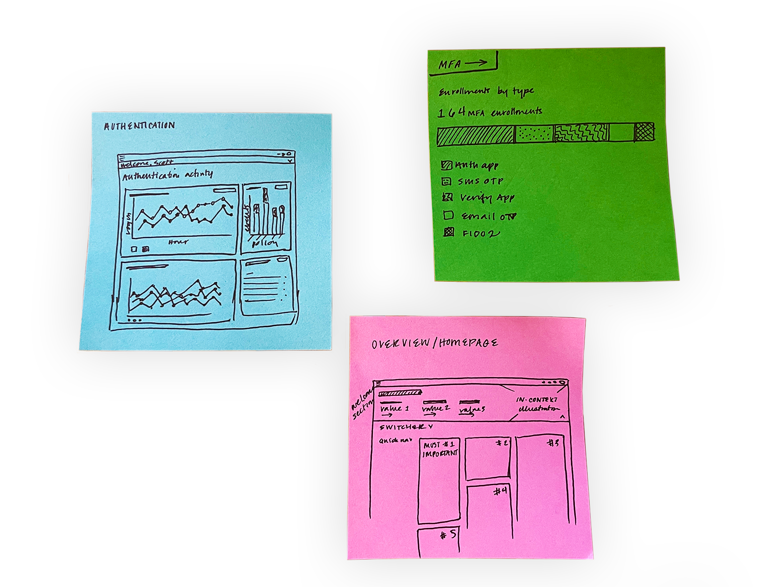
During this phase of the process, I started building a prototype to test our content. We divided our dashboard into five sections: Overview, Authentication Activity, Users and Applications, Consumer IAM, and Multifactor Authentication. This is because we are providing a lot of content for our users, and wanted to be sure we were dividing it in a consumable way.
PROCESS: USER TESTING & SYNTHESIS
After testing the content in our mid-fi designs, I worked closely with our UX Researcher to finish our synthesis, pull insights out, prioritize and start executing high-fi designs.
“I want to have [this dashboard] now! This is going to be a very big improvement for us.” - Marcello, Current customer
Some of our insights included:
Suspicious activity holds the highest value for users
The Overview layout needs modification
Customization is key to dashboard usefulness
PROCESS: CREATE HI-FIS AND DELIVER 🎉
The continuation of this project is on our roadmap. For the time being, we are iterating on the latest version of this Dashboard based on the feedback we received from testing our prototype with our clients.
This is a work in progress!

Current iteration of the Dashboard.
Carbon Design System / Data Visualization / Complex charts / Connections / Alluvial Diagrams


Contributing Alluvial Diagrams, a complex chart, back to the Carbon Design System Data Visualizations section.
CHALLENGE & GOAL
To help define alluvial diagrams, to contribute back to the Carbon Charts library so that designers can apply alluvials within their product.
WHAT IS AN ALLUVIAL DIGRAM?
Alluvial, or Sankey diagrams, are a type flow diagram designed to show two indicators of a dataset and how records distribute among them, highlighting correlations.
Multiple blocks of two indicators can be placed next to each other creating a wider alluvial diagram but it’s crucial to consider that this specific kind of chart does not show correlations between indicators that are not directly connected. This is usually emphasized using a different set of colors for each block.
Fun fact: All Sankeys are alluvials, but not all Alluvials are Sankeys.
PROCESS & EXPLORATION
Research: Audit & Define
Explore: Ensuring accessibility
Deliver: File hand-off & documentation
Future plans
THE TEAM
Cameron Calder, Design Principal
Sarah Pedregon, Visual Designer
Diego Hernandez, Developer
Eliad Moosavi, Dev Lead for Carbon Dataviz